
0
100

før Wiiuka
— Get covered
Disciplines
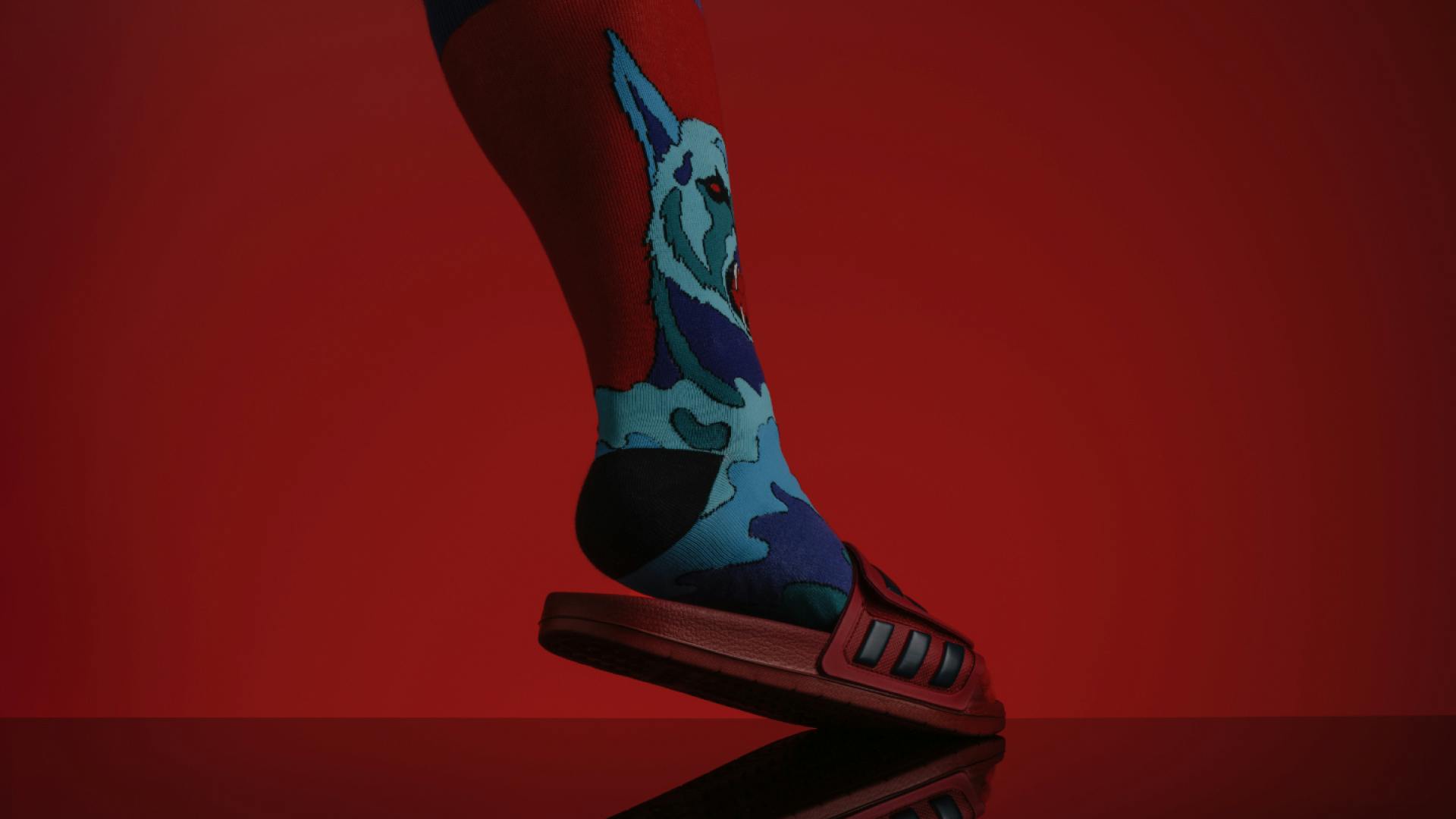
Shaping a visual identity rooted in the brand’s commitment to craftsmanship and quality. Our design tells a story of a family’s legacy.
Elevating the wiiuka brand meant shaping a visual identity rooted in the brand’s deep commitment to craftsmanship and quality. Our design tells a story of a family’s legacy, capturing the spirit behind their name and the skill in their work.
Our narrative is one of connection—a thread that weaves through the wiiuka story, binding the past to the present. The dual »ii« in the name became our muse, a symbol encapsulating the founders' unity and the product's duality of purpose: to protect and to present.
The resultant design system is an articulation of elegance and intention. Each element, from the interplay of dots in the logo to the curated naming of the product line, is a chapter in the wiiuka narrative.
The entire icon set uses the basic shape of a smartphone as its starting point, transforming it into a grid that defines a unique visual language.
Lorem Ipsum


